What did Verne's Nautilus really look like?
This page is a part of the fantastic website The Vernian Era compiled by Michael Crisafulli.
Collected from movies, books, and speculations of what the Nautilus looked like, the over 100 designs are organized by date, which shows some interesting trends. There are also links to the sources and discussion of some of the more interesting elements.
Here are some examples of the range of designs included. Including the classic design from Disney's 1950 movie.
The whole Vernian Era site is fascinating and I'll be posting more about it soon.
Keep your sightglass full, your firebox trimmed and your water iced.
KJ
A Catalog of Nautilus Designs

Milo Winter illustrated the 1954 Rand McNally Windermere Readers edition of 20,000 Leagues under the Sea. His design features large hull plates, overlapping fore to aft. The paintings of Illinois watercolorist Winter (1888-1956) first appeared in a 1922 juvenile edition published by Rand McNally & Company. You can see the color plates in Zvi Har'El virtual library - F. P. Walter's translation. The pilothouse and lantern appear very similar, suggesting fore and aft windowed structures with lanterns set on top. All of Winter's paintings show the Nautilus on the surface and I've made no attempt to extrapolate such hidden features as salon windows, prop, or diving planes. As with all the illustrator collections, proportions and feature locations and shapes vary from illustration to illustration, so the recreation is approximate at best.
 Harper
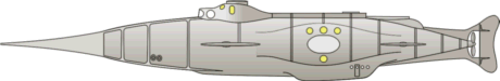
Goff began working out the design of the Nautilus in series of
drawings. The one captured here (courtesy of the folks at Disney Sub and
NautilusSubmarine) is very different from the the eventual cinematic
version. It has a more or less spindle shaped hull with bulges at the
sides for salon windows and on the lower aft portion where the keel expands to accommodate
the diving room with side hatch. There is a large, tapered ram that flares
into the hull. The wheelhouse is a complex structure with three large
windows and a set of lantern ports on the upper part. The superstructure
changes to a large deck aft with a circular hatch at the aft end. A boat
is mounted in the aft of the deck. There are two pairs of dive planes, but
no side fairings or protective rakers. Knowing what the design would
become, it's possible to see similarities, but otherwise they might not be
noticed.
Harper
Goff began working out the design of the Nautilus in series of
drawings. The one captured here (courtesy of the folks at Disney Sub and
NautilusSubmarine) is very different from the the eventual cinematic
version. It has a more or less spindle shaped hull with bulges at the
sides for salon windows and on the lower aft portion where the keel expands to accommodate
the diving room with side hatch. There is a large, tapered ram that flares
into the hull. The wheelhouse is a complex structure with three large
windows and a set of lantern ports on the upper part. The superstructure
changes to a large deck aft with a circular hatch at the aft end. A boat
is mounted in the aft of the deck. There are two pairs of dive planes, but
no side fairings or protective rakers. Knowing what the design would
become, it's possible to see similarities, but otherwise they might not be
noticed. Before
the Disney Nautilus took its final cinematic form it went through several
variations. The story is that the Disneys wanted a simple cigar-tube hull rather as described in the novel
(perhaps like that above?) and not unlike contemporary
submarines. Harper Goff preferred an intricate Victorian appearance but
could not convince the studio heads. He scratch-built this concept model
over a long holiday weekend. Walt Disney was taken by the model and Goff's
concept prevailed. The original model is lost but documented in a number
of photos. My recreation is based partly on these photos, but mostly on
Tom Scherman's later reconstruction.
Before
the Disney Nautilus took its final cinematic form it went through several
variations. The story is that the Disneys wanted a simple cigar-tube hull rather as described in the novel
(perhaps like that above?) and not unlike contemporary
submarines. Harper Goff preferred an intricate Victorian appearance but
could not convince the studio heads. He scratch-built this concept model
over a long holiday weekend. Walt Disney was taken by the model and Goff's
concept prevailed. The original model is lost but documented in a number
of photos. My recreation is based partly on these photos, but mostly on
Tom Scherman's later reconstruction.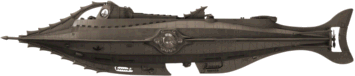 Harper Goff's
design for the Disney film is his own successful elaboration on Verne's
design. Rather than the stark utilitarian exterior that Verne described
and Neuville and Riou drew, Goff
(1911-1993) extended the ornate Victorian interior decoration to the
hull and deck. He enhanced the monster impression by adding reptilian
fins and protuberances and gave the pilothouse a crocodilian look. I
think he wanted movie viewers to come away with an impression equivalent
to that of Verne's readers in the previous century. People used to the
sailing and steam ships of the mid-1800s and unfamiliar with submarines
would see and remember a low sleek hull as monster-like. Moviegoers in
the 1950s knew what a submarine looked like, but they had never seen
anything like this Nautilus. The basic hull, exclusive of the
additions, seems to have Verne's width but a somewhat shorter length.
Two sets of diving planes are incorporated in the structures along the
side of the hull. The round salon window is placed much farther aft than
Verne's interior description allows, but then the salon, dining room
and library seem to have been combined into one room. Incidentally, some
details of the submarine and some scenes in the film pay clear homage
to the 1916 film. (My 20,000 Leagues page has information on videos of
both classic films.)
Harper Goff's
design for the Disney film is his own successful elaboration on Verne's
design. Rather than the stark utilitarian exterior that Verne described
and Neuville and Riou drew, Goff
(1911-1993) extended the ornate Victorian interior decoration to the
hull and deck. He enhanced the monster impression by adding reptilian
fins and protuberances and gave the pilothouse a crocodilian look. I
think he wanted movie viewers to come away with an impression equivalent
to that of Verne's readers in the previous century. People used to the
sailing and steam ships of the mid-1800s and unfamiliar with submarines
would see and remember a low sleek hull as monster-like. Moviegoers in
the 1950s knew what a submarine looked like, but they had never seen
anything like this Nautilus. The basic hull, exclusive of the
additions, seems to have Verne's width but a somewhat shorter length.
Two sets of diving planes are incorporated in the structures along the
side of the hull. The round salon window is placed much farther aft than
Verne's interior description allows, but then the salon, dining room
and library seem to have been combined into one room. Incidentally, some
details of the submarine and some scenes in the film pay clear homage
to the 1916 film. (My 20,000 Leagues page has information on videos of
both classic films.) 

~ 0 comments: ~
~ Post a Comment ~